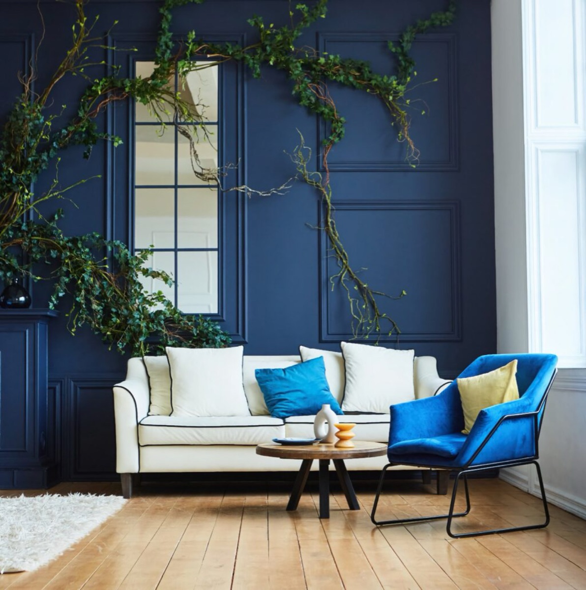
By Robert R.
Property owners remodeling or updating residential real estate across the United States regularly experience design frustration when transitioning between separate rooms, leading them to ask: how do I choose paint colors for a cohesive home? The definitive technical answer is that establishing an immaculate whole-house color palette requires selecting a singular dominant neutral anchor tone with a steady, calculated Light Reflectance Value (LRV), identifying its hidden secondary pigment undertone, and intentionally tinting adjacent common areas, bedrooms, and connecting hallways within the exact same analogous or monochromatic color family. Attempting to select isolated colors on a room-by-room basis without a master layout layout structure results in an uncoordinated, chaotic visual environment that breaks spatial flow, leaves doorways clashing, and ultimately lowers property market evaluations. For properties located throughout the diverse geographic housing markets of the United States, implementing a scientifically balanced interior palette ensures seamless room-to-room transitions, maximizes natural architectural light bounce, and builds long-term real estate equity.
Overview
Bypassing a synchronized color mapping protocol before launching a comprehensive interior renovation project causes immediate layout tracking failures that premium paints cannot hide. Colors are highly reactive to adjacent spaces; an open-concept living room layout will cast visible color reflections directly down sightlines into connecting kitchens and foyers. Throughout the distinct geographic territories of the United States, residential properties face completely different interior lighting profiles and building designs. For example, sun-drenched homes in Southern coastal states experience brilliant, intense afternoon glare that can bleach out subtle neutrals, Northern suburban properties endure cool, gray winter sky conditions that turn standard off-whites uncomfortably blue, and historic urban structures feature heavy wood trim dividing lines that require precise undertone balancing. Below, we break down the exact physics of light reflectance, color theory metrics, and professional field steps required to choose your wall colors confidently like a design expert.
Quick Reference Cohesive Color Mapping Summary
- The 60-30-10 Volume Rule: Build structural flow by allocating 60 percent of your total square footage to a dominant neutral anchor, 30 percent to a secondary mid-tone neutral, and 10 percent to controlled accent areas.
- Undertone Separation Isolation: Standardize your palette by verifying that every chosen shade shares the exact same base undertone matrix (such as all warm yellow-beiges or all cool blue-grays) to stop visual clashing.
- Light Reflectance Value Steps: Track the mathematical LRV printed on color formulas, altering values by at least 15 to 20 points between walls, ceilings, and trim to create depth while maintaining flow.
- Large Format Adhesive Sampling: Move away from tiny paper store swatches and use large, moveable real-paint adhesive samples across multi-wall sightlines to check color shifts over a 24-hour cycle.
The Architectural Physics of Visual Continuity and Open Sightlines
How Open-Concept Sightlines Track Material Color Transfers
Modern residential designs across the United States heavily favor open-concept layouts where entryways, living rooms, and kitchen zones fuse together into expansive spaces. While this building style maximizes spaciousness, it leaves no physical walls to hide abrupt color shifts. When standing inside a central living room, your eyes naturally track across multiple adjacent spaces simultaneously, taking in a continuous view of your hallways, kitchen islands, and dining nooks.
If your home’s color transitions are not carefully planned, your sightlines will run into conflicting color reflections. For example, if you paint an open-concept living room in a warm, sandy greige and paint the adjacent kitchen in a cool, blue-based slate gray, the overlapping reflections will clash along the shared drywall corners. The competing warm and cool undertones will distort both surfaces under raking light, making the gray appear uncomfortably industrial and turning the greige into a muddy, inconsistent tone. To maintain clean, polished sightlines, your layout mapping must use a unified palette where connecting wall planes flow smoothly into one another without harsh, uncoordinated breaks.
The Science of Metamerism and Light Movement
A primary reason a color layout can fail completely across an American home is an optical phenomenon known as metamerism. Metamerism describes how a single paint formula can dramatically shift its visual appearance when exposed to varying light sources. A color code that looks like a clean, neutral gray under the balanced lighting of a commercial design showroom can transform completely once applied to your home’s walls.
Incoming window light strikes your vertical wall surfaces, bouncing directly off the surrounding flooring materials and causing the visual color value to shift continually throughout the day. This dynamic shift happens because natural light changes continuously across your rooms based on the time of day, seasonal sun paths, and local weather changes. Rooms with north-facing windows receive indirect, cool light that carries a heavy blue wavelength, making paint colors lean toward cold, blue tones. Rooms with south-facing windows are flooded with warm, direct, golden light that amplifies yellow and red pigments. If you do not plan your whole-house color palette around these natural lighting shifts, your home’s color flow will break apart. This breakdown leaves some rooms feeling bright and beautiful while adjacent spaces turn dark and uninviting, an architectural challenge we analyze deeply in our national guide on how to choose the right paint color.
Structural Color Mapping: The 60-30-10 Volume Protocol
Establishing Your Dominant Neutral Anchor Layer
To build a flawless whole-house color palette strategy that connects separate rooms smoothly, professional design crews rely on the structured 60-30-10 color volume protocol. This system allocates your paint choices by strict percentage weights across your property’s total interior surface square footage, preventing any single color from overwhelming the space.
The foundational 60 percent layer is reserved exclusively for your dominant neutral anchor color. This hard-working shade coats your high-traffic connecting spaces, including your main entry foyers, open stairwells, long hallways, and central living areas. Because this anchor color touches almost every sightline in the house, it acts as the visual backbone of the property.
Excellent product choices for this dominant role include highly stable, complex neutrals like Sherwin-Williams Agreeable Gray or Benjamin Moore Revere Pewter. These tones provide a reliable, low-risk background that unifies disparate rooms. Ensuring these large background areas are applied smoothly requires clean, flawless wall profiles, a professional standard we deliver across our comprehensive interior painting services.
Coordinating Secondary Rooms and Accent Boundaries
The next 30 percent of your interior layout focuses on your secondary color selections, which coat separate rooms like your master bedroom suite, formal dining areas, and kitchen workspaces. To maintain absolute design continuity, these secondary colors must connect chemically to your dominant anchor shade.
For example, if your dominant anchor is a warm, stone greige, your secondary bedrooms can safely step into a deep charcoal, a soft sage green, or a muted slate blue, provided those colors share a matching gray undercoat tint. This shared pigment linkage allows each room to have its own unique mood and personality while maintaining a clean, cohesive connection to the main hallways.
The remaining 10 percent of your color scheme is allocated to your accent focuses. This small volume is reserved for bold, high-contrast features like your front door, kitchen islands, built-in cabinetry, or customized fireplace mantels. Limiting bright or deep colors to this 10 percent boundary allows you to introduce dramatic design statements without making your home feel small, dark, or cluttered. For updates involving detailed kitchen woodwork or matching vanities, using these proper fine-finish accent steps ensures a high-end look, as outlined in our trend report on painting cabinets with doors.
Mastering Undertone Chemistry to Prevent Room Clashing
The Pure White Paper Test for Secondary Pigment Identification
Every architectural paint color is manufactured by mixing a base liquid with varying amounts of concentrated factory color tints, such as lamp black, raw umber, oxide yellow, and organic red. These tint combinations create secondary colors called undertones that lie hidden within the dry film. When you look at a neutral paint swatch on its own inside a retail home center, your brain sees it as a plain gray or an off-white. However, as soon as that paint dries across an entire wall in your home, those hidden undertones will pop out, suddenly shifting your neutral gray into a noticeable baby blue, a muddy green, or an unwanted lavender.
To identify these hidden undertones instantly without relying on small store swatches, use a field technique called the pure white paper test. Take your color sample and lay it completely flat against a sheet of pure, brilliant white printer paper under natural, indirect sunlight. A typical target color sample might look like a completely neutral gray on its own, but placing it flat against the pure white baseline paper forces the hidden secondary undertone tints to reveal themselves clearly to your eye. Because pure printer paper serves as a neutral baseline, it forces your eyes to isolate the secondary tints instantly. You will immediately see whether your chosen gray leans toward a warm pink, a cool blue, or a soft yellow before you purchase a single gallon of liquid inventory. Keeping your undertones matched across all rooms is the only way to prevent visual clashing.
Controlling Material Interferences from Flooring and Cabinetry
Your wall paint does not exist in isolation; it interacts constantly with your room’s permanent fixtures. Light entering through your windows strikes your flooring assemblies first, bouncing that material’s natural color straight up onto your vertical wall planes. This reflection can completely alter how your wall paint looks.
For instance, if your home features traditional golden oak hardwood floors or warm cherry wood planks, that wood will bounce warm orange and yellow light onto your lower walls. If you pair that warm floor reflection with a cool-toned, blue-based gray wall paint, the competing warm and cool tones will clash, making your walls appear muddy, blotchy, and uncoordinated. Always choose wall colors that complement the natural undertones of your permanent flooring materials, cabinetry woods, and stone countertops, an essential design rule we analyze in our national guide to selecting paint colors that increase home value.
Technical LRV Tracking and Multi-Wall Sampling Protocols
Leveraging the Light Reflectance Value Scale to Build Depth
To create an intentional, high-end look throughout your home, you must track Light Reflectance Values across your entire color palette. Stamped as a mathematical number from 0 to 100 on the back of every professional color swatch, the LRV scale measures the exact percentage of available light a paint color reflects back into a room versus the amount of light energy it absorbs into the wall matrix. A value of absolute 0 represents a pure, structural black that absorbs all incoming light, while a value of 100 represents a theoretically perfect, highly reflective white that bounces all light back into the space. On this numerical index, lower integers signify deep absorption whereas higher markers represent immense light dispersion.
According to technical lighting standards certified by the Illuminating Engineering Society (IES), tracking this scale is critical for managing your home’s lighting and spatial flow. To maintain visual flow between separate rooms while building architectural depth, vary your paint choices by a controlled margin of 15 to 20 LRV points as you move between spaces.
For example, if your central open-concept living room utilizes a soft greige with an LRV of 62, you can safely transition into a cozy, intimate media room or study by dropping down to a rich, charcoal tone with an LRV of 40. Because both colors share a matching gray undercoat tint, the spatial flow remains perfectly unbroken, while the drop in LRV creates a distinct sense of depth and architectural interest.
The 45-Degree Angle Multi-Wall Tracking Sequence
To ensure your chosen whole-house palette looks perfect under all lighting conditions, you should replace traditional paper store swatches with large format, moveable peel-and-stick testing samples made with real paint. Move these large twelve-inch sheets systematically across multiple rooms, testing them directly against your sightlines across a full 24-hour cycle.
- Test Samples Across Three Separate Light Planes: Place your adhesive color sheets on the wall directly opposite your main window, on a side wall that receives indirect light, and inside a dark corner.
- Observe Color Shifts Across Four Time Intermissions: Check the samples under natural morning light, bright noon sun, dim late afternoon shadows, and under your home’s artificial LED lighting at night.
- Evaluate Sheen Reflections at a 45-Degree Angle: Stand back and look at the testing sheets at a sharp 45-degree angle to see how the paint sheen reflects room glare, an essential field technique we outline in our master manual on can you use old paint. Following this testing process helps you ensure your whole house palette flows beautifully and stays uniform under all conditions.
National Architecture and Climate Modification Factors
How Regional Air Quality and Weather Alter Paint Choices
To get a beautiful, long-lasting finish from your painting project, you must align your color selections with the climate and environmental conditions of your region. Homes across different areas of the United States deal with completely unique indoor lighting conditions driven by local weather patterns and seasonal shifts. These factors directly change how your colors look inside your rooms.
In sun-drenched southern or desert regions, intense year-round sunlight can wash out interior paint colors, making light neutrals look blindingly bright. For these homes, cooler greiges or muted stones help balance the intense natural light, keeping interiors comfortable and inviting.
Conversely, properties in northern states or the Pacific Northwest often deal with overcast skies and long, dark winters. This cool, gray light can make cool paint colors look uncomfortably cold and blue inside. Homeowners in these northern zones should opt for warm neutrals with subtle red or yellow undertones to create a cozy, welcoming atmosphere during open houses.
How Home Era and Building Architecture Guide Your Palette
The style and age of your home play a major role in your overall preparation choices and material budgets. Older historic homes across the United States often feature traditional lath and plaster walls rather than modern paper-faced drywall panels. Plaster is a dense, highly alkaline material with high pH levels that can easily scorch and destroy standard interior paint resins if left unsealed, a common defect known as lime burn.
When preparing an older historic home for a fresh look, you must apply a specialized alkali-resistant masonry primer sealer to stabilize the plaster securely before painting, an essential technique outlined in our resource on can you clean limewashed brick.
For modern homes with large open-concept floor plans, your application work must be flawless because long walls flooded with sunlight from large windows will easily reveal every single minor bump or uneven texture. Using a clean layout approach like color drenching helps simplify these expansive rooms, but using proper sanding and two-coat painting steps is the only way to ensure your large walls look beautiful and uniform under intense natural light, a design trend we analyze in our national guide to what is color drenching.
Whole-House Palette Continuity Index
Review this database reference matrix to verify that your whole-house color configurations match your specific interior room conditions and window orientations prior to starting your painting work.Spatial Room ProfileNatural Light Wave ExposurePrimary Undertone RiskRecommended Palette SetupPrimary Design GoalOpen-Concept HallwaysMulti-Directional Ambient WaveHigh Clashing & Tracking LinesComplex Neutral Anchor (LRV 60+)Connects separate sightlines with a steady backdrop.North-Facing BedroomsCool Indirect Blue Light WaveStark, Cold Industrial LookWarm Neutrals with Pink/Red TintsCounteracts cool blue light to keep rooms warm and cozy.South-Facing KitchensIntense Direct Golden Sun WaveExtreme Pastel Washing GlareCool Neutrals / Muted Sage GreensTempers intense golden sunlight and stops color washing.East-Facing Dining AreasBright Yellow Morning LightDeep Shadow Contrast ShiftsWarm Taupes / Alabaster WhitesMaximizes soft afternoon ambient light bounce.Windowless Docs / UtilityArtificial LED / FluorescentLow-LRV Dark Cave SensationHigh-LRV Crisp Off-WhitesBounces artificial light efficiently to open small spaces.
FAQs
What is the safest paint sheen to ensure color flow across all interior walls?
An eggshell or matte finish is generally preferred for the main walls to ensure smooth color flow across all interior spaces, while a semi-gloss finish is ideal for baseboards and doors. Eggshell provides a beautiful, soft look that hides minor drywall defects while offering high washability and steady light reflection. This low-reflection look allows colors to transition smoothly between dark hallways and bright rooms without creating harsh reflections or glare that can break visual continuity.
How do you connect warm flooring material with a modern gray paint palette?
To connect warm wood flooring or beige tile with a modern gray paint palette cleanly, you must choose a specialized gray shade that incorporates a warm beige undercoat tint, commonly known as a greige paint line. Pure, blue-based grays will clash directly with warm wood floors, making your walls look muddy. A balanced greige blends seamlessly with the warm reflections from your floors, creating a sophisticated backdrop that modernizes your home while maintaining design flow.
Can you paint separate rooms entirely different colors while keeping the house cohesive?
Yes, you can safely paint separate rooms entirely different colors while keeping the house cohesive, provided all your chosen colors share the exact same secondary undertone tint. For example, if your dominant hallway anchor color is a warm stone greige, your bedrooms can step into deeper shades like navy blue, forest green, or charcoal, as long as those accent colors lean warm rather than cool. This shared tint creates an anchor that maintains visual continuity from room to room.
Why does a paint color that looked perfect in the bedroom look green in the bathroom?
A paint color can look completely different between rooms due to an optical shift called metamerism, which happens when different light sources change how paint pigments look. Your bathroom may feature cool fluorescent tubes or a window facing green trees, which will alter the light wavelengths hitting the wall. This shift forces the hidden secondary undertones inside the paint to stand out, completely changing your neutral gray into a noticeable green or blue tone.
Do you need to use the exact same trim color across every room in the entire house?
Yes, using the exact same white or off-white color code for all trim work, baseboards, door frames, and crown moldings across every single room is the most effective way to tie your whole house palette together. The matching trim color acts as a continuous frame that outlines your spaces. This consistent boundary connects rooms with different wall colors cleanly, ensuring your layout transitions feel structured, intentional, and cohesive throughout the home.
Ready to Harmonize Your Home’s Colors with Masterful Professional Care?
Refreshing your home interior or exterior with an advanced, perfectly paired coating system executed by a trained crew is the fastest way to honor your woodwork and elevate your real estate value. Don’t risk mismatched undertones or dull visual clashing on your home’s finest architectural features.
Reach out to the expert national team at That 1 Painter today to schedule your detailed, obligation-free on-site project estimate, and give your property the beautiful, long-lasting protection it deserves.
Book Your Free Estimate Now